|
|
 发表于 2013-8-8 07:05:04
|
显示全部楼层
本帖最后由 critor 于 2013-8-8 07:12 编辑
I don't know if it's easier for you, but we've now translated the test to english.
________________

Hello everyone,
After our pre-release HP Prime test thanks to its software, then our hands-on Classpad II fx-CP400 test article, the potential competitor of the Nspire CX CAS from Casio
HP gave us the green light to publish articles about the HP Prime in advance :)
We would like to give thank HP for giving us the calculator, and we would also note that this test was made on a prototype calculator hardware (and software), and thus we can safely say that production versions can only be the same or better - trivial bugs found on beta OS updates being quickly fixed in the next updates. A first final OS is to be announced by the end of August. ;-)
This test is aimed to show you our general thoughts about the calculator and doesn’t go
in depth about applications, which was dealt with a little bit in a previous news (the first link above) - we recommend you to read it if haven't already, those two news - this one and the last one - are complementary, and details will be the topic of an another article soon : the comparison between TI-Nspire applications, HP Prime, and Casio fx-CP400.
Enjoy :)
Summary
- 1) Global presentation
- 2) Packaging & connectivity
- 3) Design & Screen
- 4) Power supply & Boot
- 5) The most important : Math and Graphs
- 6) Interaction and user experience
- 7) Others applications / Programming
- 8) Misc.
- 9) Conclusion
1) Global presentation
This beast you find in the middle, we would pleasantly take just as yet-another scientific calculator, however it’s NOT ; it's the HP Prime, the brand new 2013 back-to-school buzzed-about calculator, and it is apparently the (most) powerful of the graphing calculators list. And also, this girly-we-would-say is not eye-appealing and can be put with its calculator friends, limiting thief risks ... until we actually see the front side.
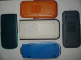
This one done, it shows a unique very clean design and a collapsable cover with 4 anti-slipping pads, set with a “hp” silver-colored embossed logo. The cover removed, the calculator shows two areas : a black one at the top with the screen where you can see the clickpad and some application keys, and a silver-colored bottom area with the numpad, operation and function keys.
 
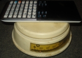
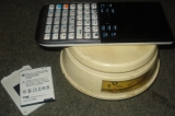
How could we miss it that much ? With only 18,23x8,58cm2, it is of course the smallest CAS-capable graphing calculator worldwide !
 
Despite this, it places itself on second position on the screen size (behind the Casio fx-CP400), with a screen of 320x240 pixels (like TI-Nspire), but with a bigger surface of of 7x5,4cm2. The screen takes the spotlight, leaving thin lateral and superior borders.
However, with only 1,39cm thinness without cover, and 1,5 to 1,6 with, it gets rid of TI-Nspire CX in the thinness race, and becomes the world’s thinnest CAS-capable calculator ;)
 
And finally, by weighting 228g, and even 180g without cover and 140g without the battery, it is also the lightest CAS-equipped graphing calculator ever marketed. A very nice pocket-sized handheld :)
2) Packaging & Connections
Here’s the packaging :
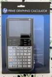  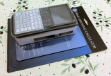
And now its content :
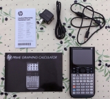 
(also with a CD-ROM not shown here)
- The HP-Prime calculator
- Warranty booklet
- 2 USB cables (micro-USB A <-> micro USB B for Prime<->Prime and micro-USB B <-> USB A for Prime<->computer)
- 1 USB wall-plug converter (there for North America)
- A quick start guide

As it is more and more the case on ultrathin devices, the HP-Prime calculator has a micro-USB mixed plug (A-type and B-type). Thus it can be used as a computer device (micro-USB B-type) or receive from its own type(micro-USB A-type). Take note that those cables are not as widespread as mini-USB cables that are not compatible. Made that way, you should take care not to lose them and to have them ready to use.
3) Design & Screen
As indicated on the sticker on the back, we have here a DVT prototype:
 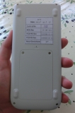    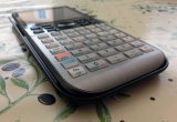 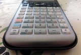 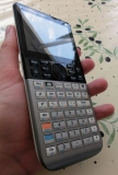 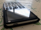  
Specifications :
- Size : 18.23 x 8.58 x 1.39 cm (7.13 x 3.38 x .550 in)
- Weight : 228 g (8.04 oz)
As said before, the design is very well made. While its weight is quite low, it is still easy to use it.
The brushed metal reminds us of a calc-concept made by Levak; the TI-Nspire CX Titanium ;)
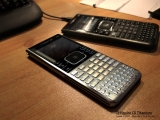
Let's note that on this prototype, the color of the calculator’s back is white. On production models, it will be changed to black.
The screen is a 16-bits color (65536 colors) 3.5" (8.9 cm) multi-touch TFT screen, with a 320x240pixels resolution. Thus giving a 114 ppi resolution (slight lower than the TI-Nspire or the CP400, respectively 125~128)
4) Power supply & Boot
The HP-Prime is powered by a Li-ion battery, which doesn’t need any cable. It's very easily put inside the calculator. The battery has a 3.7V voltage like the TI-Nspire, but for a 1500mAh capacity (giving a total of 5,55Wh). Thus it gives a higher capacity than white TI-Nspire batteries shipped with TI-Nspire Touchpad (in 2010), and its spec always lowered since that. You can find what TI makes here to compare..
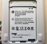 
But beyond the battery specs, one has to see if the calculators actually consumes less power. According to HP, the battery is fully charged in 4 hours and would give the calc 20 hours of "normal" usage.
After booting, we have in this order :
- HP Logo splashscreen
- Boot animation (circle equation then its graph)
- Language selection screen (only during the first boot)
- Main screen (numeric calculus)
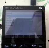
The complete boot (when totally unpowered) takes around 8 seconds. Very fast, then, like the Casio fx-CP400, making the Nspire ridiculous. Maybe security software overlays are different behind those booting times...
[youtube]o-InoqgyTcE[/youtube]
5) The most important : Math and Graphs
While those essential informations were addressed on our previous news thanks to the emulator, and will be readdressed in depth soon in our application comparaison between Prime, Nspire, and CP400, here are some thoughts and a user feeling feedback of the usage on the real calculator.
Some points are actually so important that they may also appeared in comparaison news and could be already addressed on the previous article.
- Calculus :
. Lets say this again as it is quite important : the numeric mode and the CAS mode are separated. The numeric mode (which actually has an exact engine) is the default mode and is the homescreen as well (“home” icon). To enjoy the CAS engine (based on the French, free Xcas engine), you only have to press the “CAS” key.
From the user POV (used to the Nspire), we are not convinced that this separation is very useful. In fact, it is perfectly possible from the CAS to ask for an answer with a numeric approximation (approx() function). So... why would we limit ourselves ? And that’s quickly annoying as it makes the user angry when we are not in the right mode, and seeing “Syntax Error” out of nowhere (depending on the case, letters are not automatically variables - you must create them) or unobvious results (most of the times 0, because variables are initially 0).


Numeric mode (homescreen) and CAS
. We remind you that if you are a RPN fan, the Prime boasts a native input for this :) However, it is not usable with the CAS, unfortunately...
. When we are not used to it or new to the platform, some graphics are... cryptic. This one, for instance, shows a matrix being edited. The cursor is effectively on the first cell waiting (flashing), and the 2 symbols “plus or minus” are here to put the cursor so when you input a number, the matrix grows up in the wanted direction and when the number input is done, or when you press del, the column or row where you are deletes itself. Once we understood, however, it looks like “well, why not.”. However, it’s not very intuitive for the user.

- Graphing :
. Graphic features are spread accross several applications : Functions, Advanced graphing, parametric, polar, sequences, geometry. We also have “explorators” : quadratic, trigonometric, and affine.
. Nothing hard to graph everything we would like : depending on the mode, we choose the corresponding application, we put the equations on the available windows by
 . We then press . We then press  . To have a table with corresponding values, we press . To have a table with corresponding values, we press  . All this looks intuitive, and the graphing is very, very fast. . All this looks intuitive, and the graphing is very, very fast.
However, we can only have 10 graphs. Even if I don’t see any interest to graph 10 graphs simultaneously, I do not neither see the reason to actually limit the software to this amount.
. Nothing specific to tell you about functions offered on basic applications - not too much, nor not enough.
. HP really insisted on the graphing capacity of the Prime, which other calculators can't dream of reaching. And by looking at those screenshots, it is probably true :

It looks very well made but... what’s the point of all this in the curriculum ? (French, at least.. .?)
Have you ever had or wanted to input a formula like :
(SIN((p/LN(2))*LN(2*v(X^2+Y^2)*(6*COS(ATAN((MIN(ABS(X),ABS(Y))/MAX(ABS(X),ABS(Y)))))+v(36*COS(ATAN((MIN(ABS(X),ABS(Y))/MAX(ABS(X),ABS(Y)))))^2-27))))*SIN((p/LN(2))*LN(2*v(X^2+Y^2)*(6*COS(ATAN((MIN(ABS(X),ABS(Y))/MAX(ABS(X),ABS(Y)))))-v(36*COS(ATAN((MIN(ABS(X),ABS(Y))/MAX(ABS(X),ABS(Y)))))^2-27)))))=0
?
6) Interaction and user experience
- Touch side :
. In contrary to the Casio approach with the CP400 shipped with a stylus, HP chose something that everyone has : fingers.
Indeed, the fingers, because the screen is multi-touch and some gestures are used for instance like in the trigonometric explorator to change amplitude or period, or in the spreadsheet to modify cell sizes. Unfortunately, the multi-touch is not yet developed enough (we would have liked a zoom, obviously, on graphing, as it is probably the first thought you could have of a multi-touch on a graphing calculator...). Frustating !
. Regarding mono-touch, the OS is very well adapted for its interface. We are surprised however, by the smoothness while scrolling, for instance the applications screen, or on a graphic. You probably also saw it on the video at the top. :)
However, a more subjective observation than the other ones : there is no “bounce/elastic scrolling” like we could see on other touch devices, which allows us not to have an instant stop before going out of bounds.
In Settings for instance, we have absolutely no scrolling however, even though a swipe works to go from a page to another.
. However we note a problem around the interface and touch input : some GUI (Graphical User Interface) elements require a touch interaction even if you thought it’s not needed. For instance, a drop-down list : Impossible to expand it out and thus impossible to choose an option if we do not use our finger : no keypad interaction is given for this, weirdly enough. It's quite strange that HP “forces” touch usage when it’s not natural or does not improve the user experience.
Maybe this software issue will be fixed in future updates if enough people report it ?

- Keyboard :
. The keyboard is very pleasant to use. It is however a personal opinion, but the keypresses are not too hard, not too soft ; it is well balanced, and this to be a habit on HP devices :)
. As you could see on photos and/or the emulator, every (or almost) keys has 3 different functions, which is neither too much or not enough, as most secondary functions are available with Shift of Alpha.
. Speaking of Alpha... the Prime allows us to write uppercase and lowercase, caps-lock on or off. However, those manipulations are not easily done, as we can see in the manual (see the screenshot)
What could be made clearly : “To put capital letters, press first ALPHA. For a lowercase letter, press Shift first then Alpha. To enter Lock (capital or not), add an “ALPHA” keypress at the end of the previous combinations. To exit Lock mode : ‘Esc’. “. Special cases (adding a letter of a different caps mode) are available, why not, but you really would have to want it... In fact, it is a situation where a separate keyboard for characters is very useful, as on the Nspire...

. Something else that would make TI calculator users annoyed : as you could probably note : the Enter key is not at the bottom right like other devices, but in the middle, at the right... How many time I went pressing “+” at the end of expressions, freezing my hands and watching the bottom right of the screen to wait for the result to show up without having a doubt that I didn’t press Enter... However, it is something to get used to, not much of a problem :)
- Applications/Interface :
This is... huge. Don't expect to find here a full list of things we could say about those applications, it is the subject of the soon-coming news :) Here, we will talk about user experience and the ergonomy made by HP through the applications and the OS interface in general, etc.
First of all, HP did not pick up the TI's Nspire "architecture" of having a system based of applications (“widgets”), in a page (tab), taking place in an activity, inside a document (.tns file), which are available like others, in the document explorer. And if it’s needed or is an emergency, there is the “Scratchpad”, a sort of “popup” which has a calculator and a graphing application (the core of graphing calculators).

Nspire architecture
In short, the Nspire has an architecture close to the one found on computers. And I think it is something that attracted a lot of Nspire users : intuitive, since we are used to such a behavior, well, obviously when we are not used to an other platform, of course.
What the Prime gives us is a radically different way and comes close to the way it is done on non-Nspire calculators, i.e... no file system architecture. But not unlike TI-z80 (82,83,84...) : Everything goes through a system of applications. It could be compared to TI-68k (89,92,v200).
We are on a sort of giant “scratchpad” where all applications are available (but not at the same time...) while you can not save a “session” which could have several applications to create a full activity about a specific theme like on the Nspire. The 2 only “applications” (which are in fact not), are the numeric calculus and the CAS, which have their two respective keys on the keyboard.
What we have, is a system which can “clone” an application (the calculator comes with 18 apps) by customizing with its own initial parameters/content. It is really weird for me and would leave people who do not master this with doubts and questions... : why should we duplicate an application instead of creating our own “context/document” with these or those applications ? In addition to this, however, is the possibility of Basic programs to “access” system parameters and thus makes easier to customize whatever where you want. It is indeed customized applications and programs which calculator users can transfer, like on other calculators as the TI-z80 or 68k.
But that’s not all. Every application has its own principal features/settings (via [Symb], [Plot], and [Num]), its own “views”, its own functions, and its own variables. Some functions and variables are usable via other applications.
On a document by G.T Springer from HP, we can see clearly what's behind the primary application, “Function”, which we must use to graph functions (and yes, I must write it, if we are in an another application, we can only do what it's made for (and access the calc functions, of course).

Strangely, the 3 left panels are captioned “App Views” whereas the system shows those views of these applications like :

What we do see in the global picture is more like the 3 principal features screen of the application. However... back luck, the official name is also “view” :
 . This adds a confusing layer for new users. . This adds a confusing layer for new users.
As said before, those 3 screens have features which are (respectively) displayable with the keys  , , et et  (when the application allows it), which are physical keys and available even if it’s some do nothing... I’m not fond of this to book up even more the software and/or hardware with such things that are not used in some contexts, it is simply waste and take space for no use at all. (when the application allows it), which are physical keys and available even if it’s some do nothing... I’m not fond of this to book up even more the software and/or hardware with such things that are not used in some contexts, it is simply waste and take space for no use at all.
In short, lets go back to the subject : each application has, or not, its own behavior, linked to 3 keys, “Symb” should be for everything “symbolic” (data and primary settings of the applications), “Plot” is for everything graphic, and “Num”... is for everything numeric (like a spreadsheet).
Some words about those “views” : once again, it is a physical key which is not available all the time ( ), and list the whole shortcuts and features involved in the application (go figure why on graphic applications, 4 shortcuts out of 6 are for zooming). ), and list the whole shortcuts and features involved in the application (go figure why on graphic applications, 4 shortcuts out of 6 are for zooming).
In short, I’m telling myself that it’s only the essential, the Prime forces your thoughts to think by application, and to restrain yourself in its domain, and as long as you do not exit it, you can not do something else if the application is not made for it. For instance, it is impossible to have several graphic windows opened at the same time, several spreadsheet windows, program editors, and so on. Thus no “multitasking” possible if I could say so. But the hardware is well capable of handling this !
In short : Troubling ... but not necessarily disturbing when we need one thing to be done and only one (at at time). But if we need more, it's just not possible.
By the way... we are indeed becoming more and more picky but … it is annoying to have some inconsistent UI, from an application to an another one, and I think that it’s not very professional, I would say. Some examples ? :
* Most of the times on devices, if not always, when we have a status bar, it is there for forever, and is globally for the system (we could think about computers’ OS, but also other calculators). On the Prime... it is sometimes here, sometimes not here... (And if a reason was to get more working space on the screen, look at the next point ;-) )
* This is also valid for a menu bar. It is always visible, too. But sometimes it has 6 buttons, and some can be empty ; sometimes there are “holes” ; sometimes only one button is visible... It is not that much uniformly made... We could wonder if it's in an effot to make the buttons be fit for their context... but, in this case, why not having provided a more optimal solution for our taste (and it is already implemented on Nspire, for example) : showing the real menu (and not otherwise, by getting space on the screen) a button is pressed (a physical one on the keyboard, obviously...) ? … but this button is not available (I’m saying it doesn’t do “nothing”), it is only here as a bridge -for recalling expressions- between the numeric and the CAS engine, and to access the “messages” system.) … but this button is not available (I’m saying it doesn’t do “nothing”), it is only here as a bridge -for recalling expressions- between the numeric and the CAS engine, and to access the “messages” system.)

Here is the different looks that the menu/action bar can take, the most striking issue remaining those empty buttons that emphasize dissymmetry.
     
* Others “details” for a detail-looker ?
The inconsistence again and the unoptimized layout of some screens (here, plot setup) :

We hope that those modifications will be available on future updates !
Exam mode :
. The Prime features, like the TI-Nspire, a configurable Exam mode (we were speaking about it here), but with a larger choice of banning/allowing features - in fact, we can pretty much get rid of all features.
Here is an image of the general configuration menu, the features choices to block, and an example of blocked CAS (through the menu allowing quick access to functions from the home screen -numeric calculus-)


The Exam mode can be turned off after a fixed time or if the user enters the password used while configuring the Exam mode.
The Exam mode verification is possible by supervisors when they walk through the rows thanks to a banner going from blue to red, facing supervisors with 3 blue/green/red superior LED visibles from the back if the case of the calculator is not too much leaned.
 
7) Other applications / Programming
- Programming on the calculator is possible, in HP Basic, known for its lightning-fast speed. This language is compatible with HP-39GII.
You can see some benchmarks and comparisons with many calculators on
HP-Museum
In short, we have, for the same program (only syntax differs according to the maker) of the N-Queen algorithm :
1min30 on the Casio CP300+ (!), 2.1 sec on TI-Nspire, and 0.4s on the HP Prime.
Thus, the HP Prime has, according to those tests, the fastest non-compiled language (interpreted ; if it’s one), behind Lua on Nspire (0.045 sec.), a remarkable performance for a Basic language ! What would Lua give if HP allowed it... ?
Speaking about “non allowed” (at least, not implemented), we can note that only Basic is possible (and no SysRPL unlike other HP calculator models). As far as we know, no SDK is planned - and thus no native Programming in C or ASM, and not even a mid-range language like Lua. That's too bad...
However, it is not impossible that if the platform is getting developers interested in it enough, we might see security exploits found and used to allow native calculator language, like on the TI-Nspire through the Ndless jailbreak.
8) Misc :
Some points we found while using the calculator, that we’ve missed (or were not here) on our news on the emulator :
- Weirdly... no option to change brightness ! It is missing and it’s something important that should have been made (makes very hard to take photos when the contrast is not high enough, i.e. bright rooms for instance...) We hope it gets implemented on production versions.
EDIT : It's actually there, just not documented : [ON] + [+]/[-]
- It is possible to change the cell size on spreadsheets (with split view with a graph for instance) in multi-touch (it wasn’t written on the manual, no ? :D), thus it’s a general independant font setting, which the Nspire doesn’t provide (only one global setting).
- The Reset button, on the back of the calculator, is hardly usable or even impossible to press without a very thin spike. Forget pencil leads or thin stylus which works on Nspire and many other calculators. We hope that this means that the OS is butter stable … ? ;-) Otherwise, I don’t think people will not try to increase the hole size, so a pencil lead can access the button (on the motherboard, the button is way much bigger, so no problem on this side).
Edit : [On]+[Symb] seems to do the trick too :)
- Copy/paste exists, but more shortcuts could be used, as available on Nspire, like Ctrl-A (select all), Ctrl-Z (cancel), Ctrl-Y (redo), which are not implemented (only through a menu in Notes/Info).
- Currently... it is not possible to select something else than a “block” or some other mathematical expressions, for instance ! I saw on Internet that this wasn’t intended, otherwise I wouldn’t address this to you by thinking it would get fixed in later releases... but no. To restart from a previous complex calculation, you have to select all of it and remove all the unwanted parts one by one...
- (While we’re here, another one even if not linked to the calculator itself : On the software, the multi-touch is implemented by pressing both left and right keys on the mouse at the same time - followed by a motion.)
- Currently, we do not have the transfer software (“connectivity kit”), but it will soon come.
- We couldn’t have yet test the calculator with its extensions, such as StreamSmart sensors, or the wireless module. We imagine clearly that this would be a bonus :)
Conclusion:
Without any particular order, here’s a table which summarizes the good parts and those that may need some improvements :
Main positive points :
- Design / Comfort
- Specifications
- Overall speed (calcaultions, graphs, programs)
- Basic compatibility with the HP-39Gii
- Good color screen usage
- Good CAS engine (even if some points have to be improved)
- Price (relative to its competitors ; 155
|
|
 匿名人士
发表于 2013-8-8 18:53:32