Classpad Logo
by Northern_Snow & Nbzwt; Translation by chsi
I am privileged to get my hands on the latest fx-CP400 at Casio Shanghai. I must say it feels a little awkward doing a comparison between Casio's product in its headquarter with those from its competitors, but nonetheless comparisons are necessary to users like us. So here is a comparison between the CP400 and several other popular models in the market from a user's perspective. This review might be somewhat unfair to Casio since both I and Northern_Snow use TI calculators primarily, but for this reason we could shed some light on its user-friendliness towards new users. Also, the focus of this review will be more on the hardware, since the Chinese OS has yet to be released, and also because Casio has already released the emulator for those of you who would be interested.
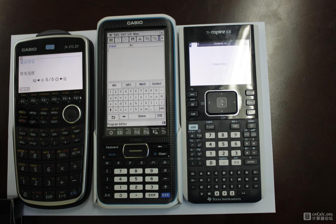
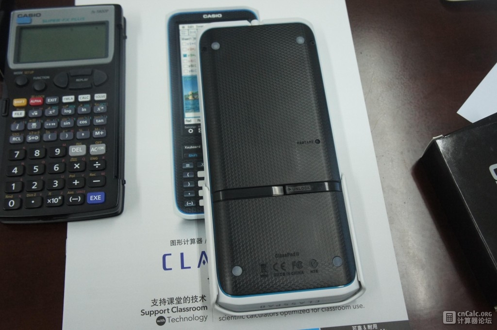
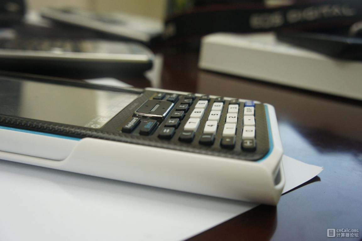
When we first got our hands on CP400, we were impressed by the size of the machine, particularly that of the screen. Following are the dimensions of CP400, amongst its competitiors.
| CP440 | 206 x 89.0 x 21.1 (mm) |
| Nspire Clickpad | 201 x 99.1 x 21.6 |
| Nspire CX | 191 x 86.4 x 15.2 |

Classpad Logo
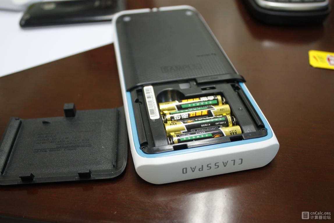
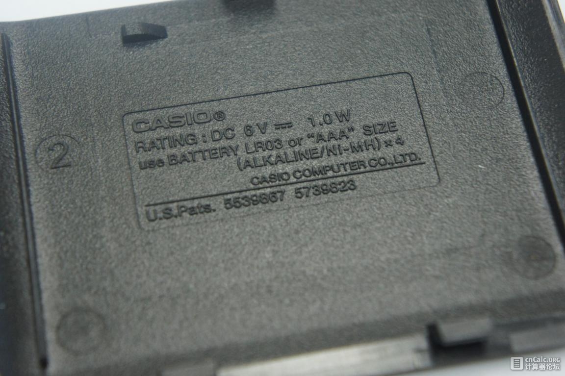
Under the battery cover are four AAA cells connected in series. In the menu there's an option for alkaline cells or Ni-MH battery.
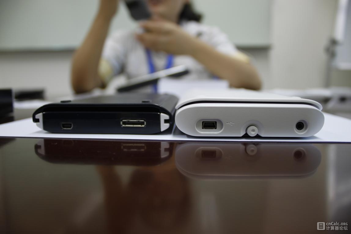
CP400 is thicker, probably because of the batteries it uses.
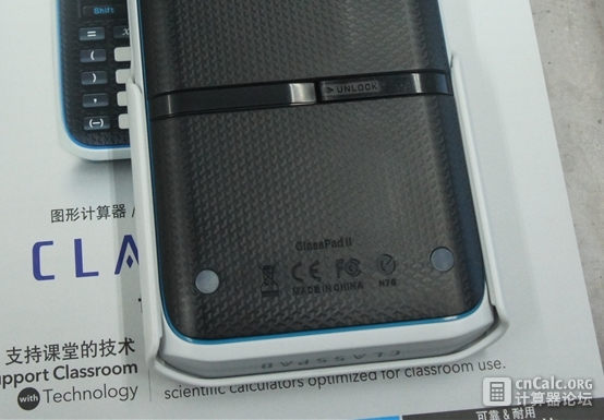
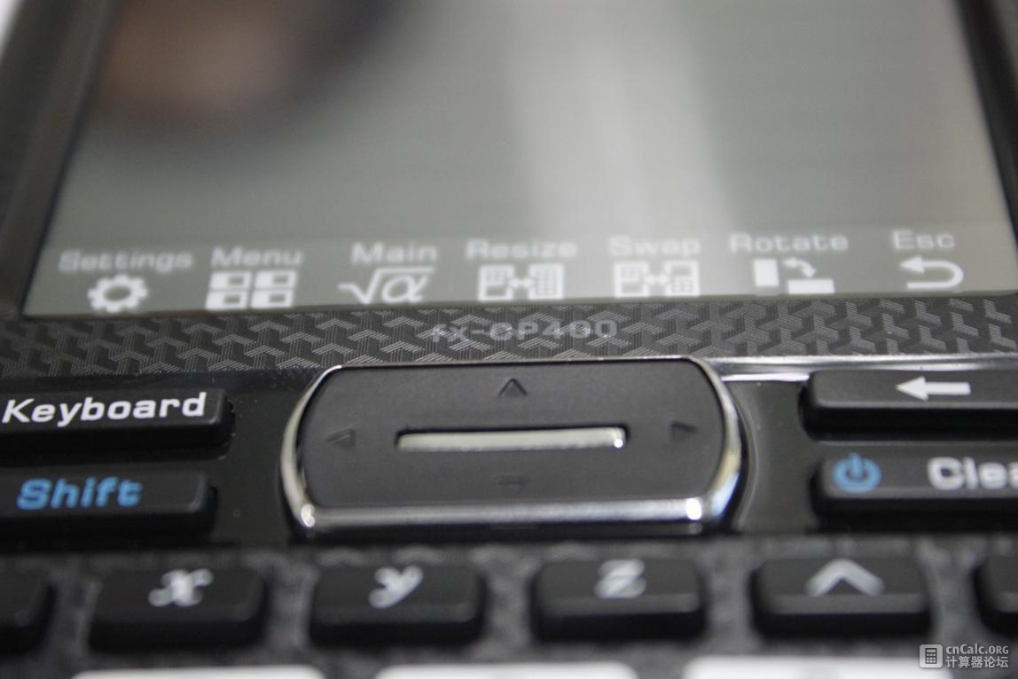
The model engraved at the back says "Classpad II", while it's printed as fx-CP400 in front.
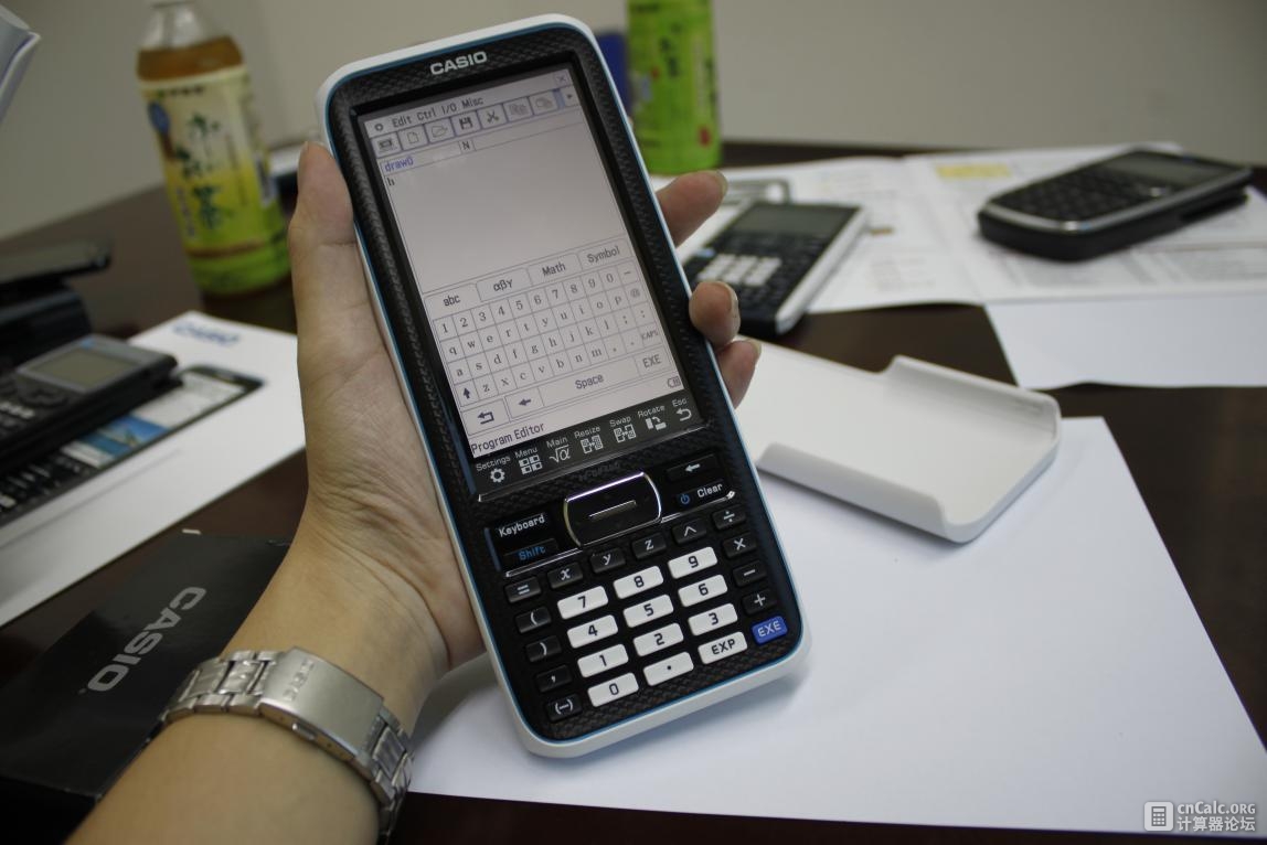
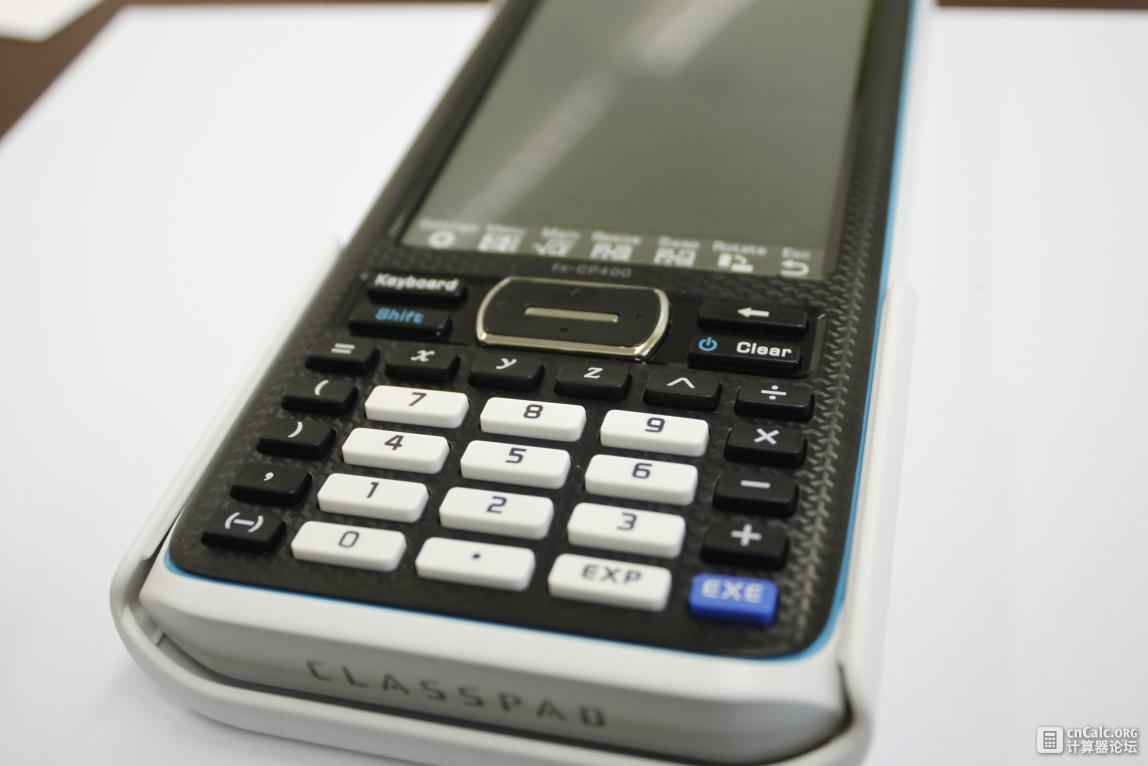
The keys have an ergonomic design. They come in a long, narrow shape with a certain oblique angle. In this sense they bear some resemblance to those on Nspire CX. They however feel softer, which lies somewhere between fx-991ES Plus and fx-82ES. The exact feel is more of a subjective matter and we could not arrive at a verdict vis-a-vis its competitors. Personally I prefer CP400's, but Northern_Snow does not really agree.
This is Casio's strength. The enormous size of 4.8 inch is unprecedented in calculators, with a resolution of 320*528. Although it loses out to many mobile phones in the market in terms of pixel density (128 ppi), but thanks to Casio's exclusive technologies, they have a remarkably high aperture ratio (that is, the ratio between the transmissive portion of a pixel and its surrounding electronics). Therefore it looks much more impressive than that on the CX. CG20's screen looks pretty as well, with a high resolution and brightness. The following pictures will explain them all.
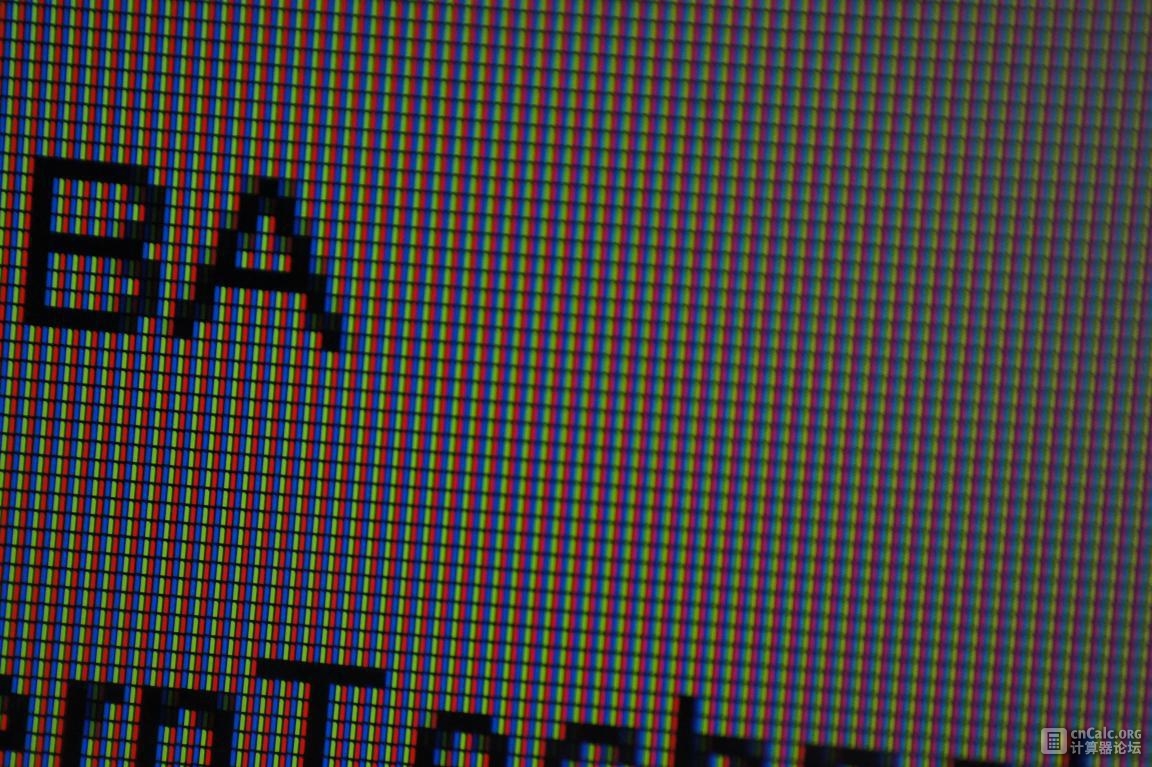

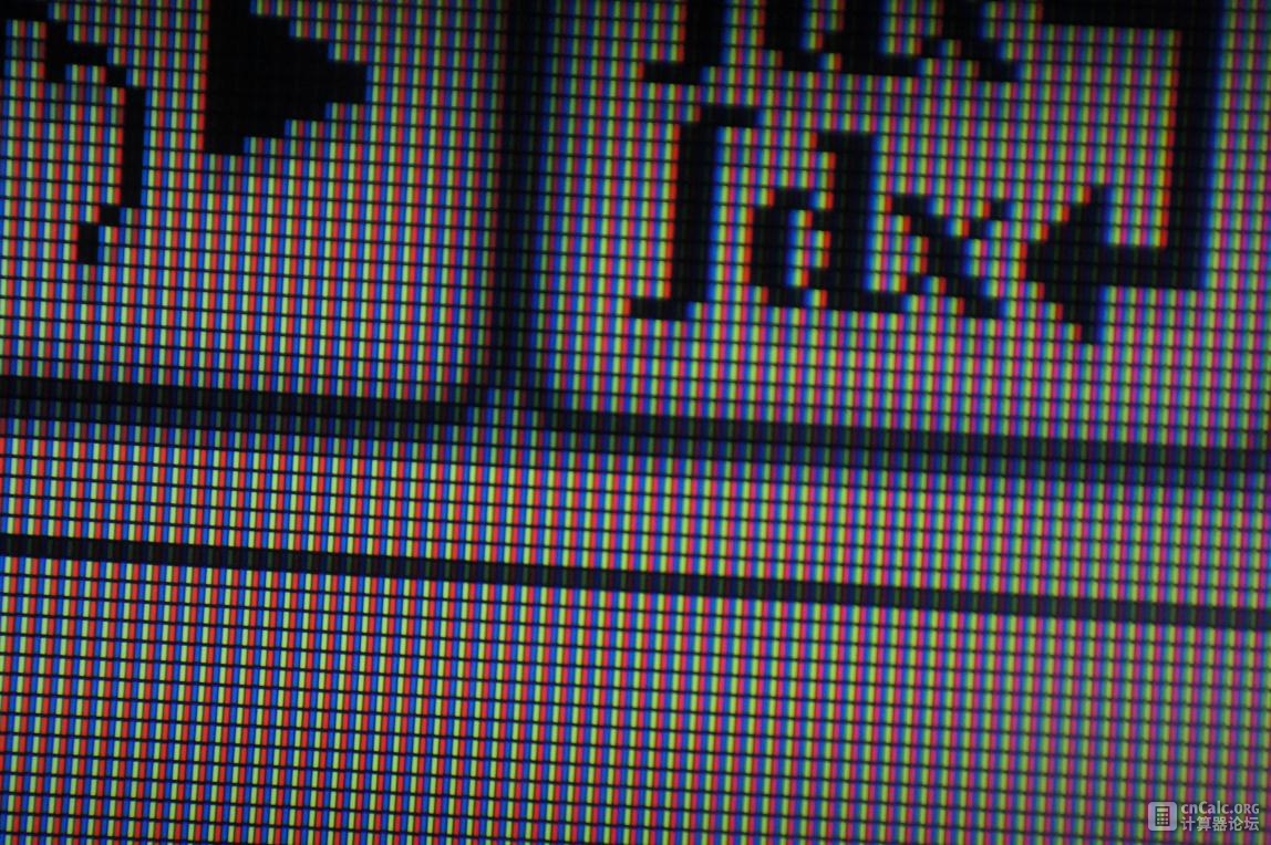 The first is the screen on CX, followed by CG20 and CP400. They are taken with the same focal length, so they clearly illustrate the difference in pixel densities as well. Unfortunately we couldn't do any testing on colour saturation as there are no picture files in the calculators. All we could tell is that CP440's colour is more on the warm side, which might be to the liking of Asian users.
The actual clock speed of CP400 was not revealed to us. Under the hood there is believed to be a Renesas SH-4, which is faster than that used in CP330. It however feels slower than CG20. We did a brief test on the speed with N-queen problem and here are the results.
fx-CP330 2m 15s
fx-CP400 1m 34s
fx-CG20 40s
Nspire CX 27s
All tests are conducted using on-calc BASIC programming. As is apparent from the results, the figures here do not really do justice to the CPUs and there is much room for optimization. Judging from the above CP400's clock speed should be around 50MHz. Because of the colour screen, display operations are clearly disadvantageous for CP400. We found the print function slower than that on CP330. With regards to start-up speed, CP400 takes merely 2 seconds. Pretty impressive.
Currently only on-calc BASIC is supported. Since we are no experts in BASIC programming, there was not much testing we could do. According to previous reviews by Casiopeia, the BASIC language used in CP440 is reasonably powerful. There are add-in supports, but SDK is absent.
The input experience is a major concern of many for touch-screen calculators. We believe this problem could be divided according to different usage situations. As for input of basic expressions, the touchscreen clearly loses out to the good, old physical keypad. We did a rough trial on the spot with this expression:. The total time taken for CP400 is 14 seconds and 8 for CG20. With RPN, it took us only 4 seconds on the HP-42s.
In more complex applications such as calculus and advanced mathematical operations, however, CP400 has gained the upper hand with its touch input. On physical keypads we need to look up the function in the Catalog menu and hit arrow keys repeatedly to select. With CP440's touch screen, this could be done faster and with much greater ease. In comparison to its predecessor CP330, with a larger screen, the likelihood for input errors is reduced, thereby helping to speed up inputs.
In terms of programming, the input is made more convenient with the touch screen. A full QWERTY virtual keyboard
can be displayed in the landscape mode.
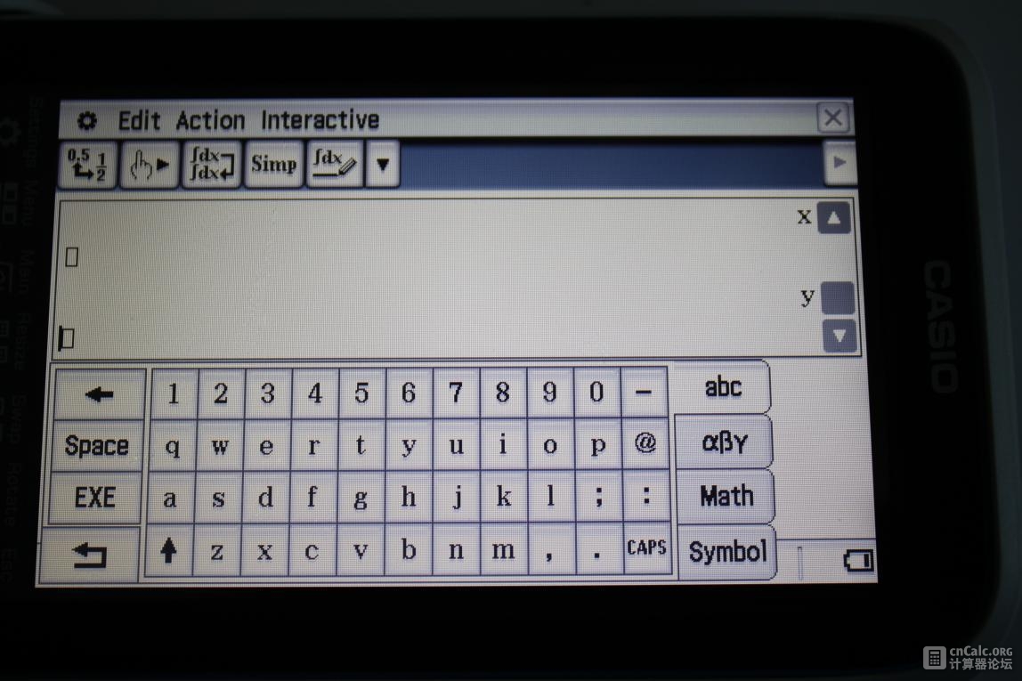
Moreover, commands such as if and while can be typed in directly with the alphabet keypad, rather than selected from the menu above. This offers a higher efficiency as compared to CG20. Although Nspire comes with a dedicated alphabetical keypad, the input speed is greatly compromised by its counterintuitive ABCDEF arrangement. Nonetheless I still believe TI-92 is the best in this aspect, but we would not include it in the review for its vastly different position in the market.
CP440's battery life is indeed commendable. With a 4.8 inch screen and just 4 alkaline batteries, it lasts up to 110 hours in normal usage. Perhaps this explain its relative slow speed (for power savings).
All we know right now is its MSRP of 175 euros in France. At this cost it is quite a good deal, but the pricings in other markets are yet to be released.
Hardware wise, although the design is already fixed at this stage, we would still like to see a physical Menu key being added. The row of shortcuts at the bottom of the screen is of little practical use, and sometimes gets in the way of touchscreen operations. As for software, there is much room for improvement in terms of BASIC execution speed. It would be great if CP400 could match that of its cousin, CG20. Scrolling isn't very smooth on the main menu, too. We would also like to recommend improvements on the official webpage (such as the page that appears after clicking on the download link). Currently they look somewhat shoddily done.